I got up really late (yes, benadryl again, because my skin is unhappy being on me, and wishes to be scratched off.)
So, I’m vaguely hang-over-y and out of it, and have some work I need to do this morning.
Another Rhodes moves SLOWLY towards publication, probably next month. Hey, it’s not Jan 2020 but it’s only a year and a half late. Coff.
I will try to get at least Bowl of Red up next month, also. …. Dyce — A Well Inlaid Death — probably not till August. Then there’s Winter Prince. No Man’s Land is in progress…. Oh, yeah, and Darkship Defiance and Hacking the Storm (Fuse) should be out before the end of the year.
Today I need to buy Dragon naturally and train it. I’m told professional will get my accent. We’ll see…
I tried having someone transcribe my stuff, but I got way too self-conscious.
Anyway, I have been redoing the cover for Rhodes, and I think we’re down to these two choices.
What do you guys think? (The wording for the series will change, and at any rate it can be gray where it goes against the white.)
Actually what to use for the series is an issue too. Rhodes works, and I tend to be cranky and just go with what works. I suppose Rhodes Mysteries book 1 will be the tag (and book 2 etc, oh, geniuses. I’m not calling all of them book 1! Don’t make me stop this blog and come back there.) I’m going to do this in novels (short, about 40k words), novellas and shorts, so…. “book” works.
I’m open to suggestions as well as opinions on the covers. Mostly because if this kind of thing worked for Jim Baen, it can work for me. So, fan opinion on covers requested. And suggestions for series title/wording.
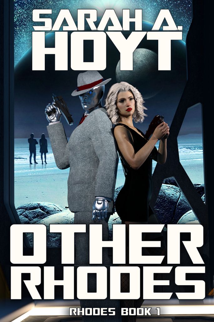
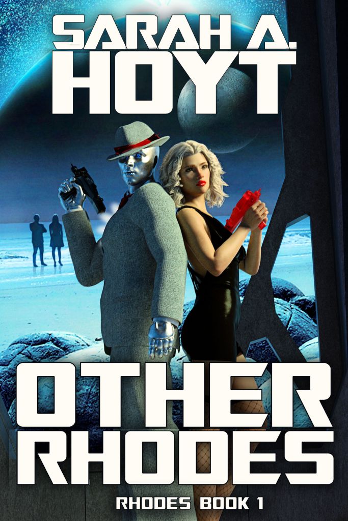
This might not be the final form, but there’s a good chance it is. Because the book has its roots in the thirties (though not the real thirties, it’s complicated) and because of how they then view the thirties, the attire is appropriate. And now I’m done fussing with it.

Keep the strong foreground lighting in the second one (very noir), but change the red pistol back to black. The red one looks like a training item or a toy.
LikeLiked by 1 person
Absolutely agree. The foreground lighting lets you make out the figures better. Helps bring out that the male figure is a cyborg (or robot, or whatever). I know you can see from the hands, but that’s too easy to overlook. Also agree about the color of the handgun. Should go back to black.
LikeLiked by 1 person
Exactly what I was going to say. #2, but with a black gun.
LikeLike
I like #2 (easier to see pistol details), but 1) Black pistols for both, 2) could she get the darker lip color as in #1?
LikeLiked by 1 person
+1
LikeLike
Cast me as another vote for #2 with both guns black. One other comment, though – the guns look very much like Star Trek phasers with the pistol grip. Any chance Paramount would complain?
LikeLike
There are only so many ways to represent “ray guns” I can play with proportions, but that’s about it.
LikeLike
I swear, every time you say “ray guns” with this series I’m going to laugh.
LikeLiked by 1 person
Better than a Herblaster, eh?
LikeLike
Something like that.
LikeLike
Black as the main color for the guns but with gray or silver (stainless Steel) for parts to show more detail. With just black guns all the detail disappears. Even detail colors would work.
You appear to be using Star Trek hand phasers as the model for the pistols. That forward grip is NOT ergonomic, that back end gets in the way. Also they are far too large. Where would SHE carry it. For HIM not a problem but still large. I would suggest something smaller for her more normally configured with out an ejection port but with halo Sights. Him also more normal, larger, silver with black or blue details. no ejection port or slide. He doesn’t need sights.
Purse or belt bag that would carry her smaller pistol and be concealed. Belt Bag NOT holster shaped.
I know picky but you know us gun nuts.
BTW: Fishnets? Really?
LikeLike
I can’t use any other detail. There are limits.
Dear LORD. I’m not using phasers.
These are energy weapons.
As for carrying, presume she left her purse off scene.
Yes, fishnets. Part of this takes place in the past.
LikeLike
Or do you think his being in a suit is spurious.
AGAIN I’m using 3d models. I can’t “pick out” anything. It’s one solid surface. (rolls eyes.)
I’ll point out if these were paintings, what you’re suggesting would be about 5k worth of changes.
LikeLike
Sorry you’re bringing flashbacks to guy who told me that I couldn’t call guns burners, because no one used that name, without stopping to realize I MEANT burners. (As in energy weapons.)
Most of your “critique” makes no actual sense. Like “where would she carry it?” Well, this would make perfect sense if it were, oh, a big scene and we knew exactly what happened before this, or if I were a movie. But it’s a cover. Almost everything on a cover is symbolic. You can pick it apart till it crumbles, but that is not particularly important.
LikeLike
Well they are beamers based on alien technology after all.
Is this scene inside a merci or reality? Inside he would look human and either disfigured or wear a mask, and the weapons would look like 1930s revolvers or automatics. Outside this scene wouldn’t occur as he never leaves his office on pain of immediate death.
But then I am operating under a handicap here having read the blasted thing already. Y’all are going to love it by the way, action, pathos, sax, violins, it has it all.
In any case a cover does not have to represent a scene in the book. It just has to entice a potential reader and hint at the contents major concepts which either choice does quite nicely.
Obviously art is not my strong suite.
LikeLiked by 1 person
Probably inside a mersi.
LikeLike
If your ray-guns are light guns of some kind, they’ll need a projection aperture of some sort (main lens). For lasers wavelengths, over pistol distances, size doesn’t really matter. As the wavelength increases into infrared and microwave, the larger the lens the longer the distance over which you can keep your beam collumated. Also need a way to reject the heat generated: Some sort of cooling gas port probably.
LikeLike
If your laser gun ended up looking like an evil flashlight, or your microwave gun had a big dish on the front, it might be entirely justified by physics.
You’d want to keep the main lens of a laser weapon *very* clean though, otherwise all that heat will just blow up your lens. So maybe a flip-down lens cover or something.
LikeLike
Sigh. They’re energy guns. And I’m not designing them for verisimilitude. I’m putting them in so people go “oh, yeah, that’s a gun” at first sight in a cover.
LikeLike
Just throwing some ideas out there in case they end up interesting. If you asked me to draw a cover it’d end up being the title against a solid background (or a pencil-scribble drawing.) (My aesthetic sense is elusive). Good luck with your new book.
LikeLike
#2 with black weapons.
LikeLike
Ditto.
LikeLike
yes I second this
LikeLike
I select 1, because in 2 my eye goes straight to the gun and sees nothing else. At least in 1 my first instinct is to read the words of the title/byline. :)
LikeLiked by 1 person
I like the top picture, but it needs more contrast in the background – the cyborg doesn’t pop out. But, I like that darker metal look – stronger and more enigmatic. She on the other hand, looks a little vacant in both pix. Could you add in a more watchful, alert expression or posture?
LikeLike
I think hte problem is it doesn’t look AT ALL vacant to me.
LikeLike
Don’t care for the red blaster, and they kind of look like Phaser ll models? Not being mean, but I always liked the one used by Retief in “The return of Retief” More pistolish,
LikeLiked by 1 person
Sigh. I considered a truly retro bulb-pistol
Do understand in the story, they DO NOT use projectile guns.
LikeLike
I like the truly retro bulb pistol.
Since everyone is saying phaser, maybe something inspired by the phasers from “The Cage” pilot.
LikeLike
I do too. My issue is to get it to go in the character’s hand. Even with the better computer, it’s easier said than done.
LikeLike
FWIW, the shape of the weapons didn’t bother me any more than any other sci-fi weapons circa 1930 to 2020. (“Daddy, why do Imperial Storm Troopers use WW2 Sten guns and MG42 machine guns?”)
LikeLike
Because the MG42 is so awesome that even the notoriously poor shots that are the imperial Stormtroopers recognize it’s awesomeness.
If the fellow doing the conversion drawings for the US Army tests of the T24 had not screwed it up the MG42 design would have been adopted by the US as superior to the 30-cal MMG, and eventually rebarreled to 7.62NATO as was done in several European militaries, possibly would still be serving alongside the John Moses Browning (PBUH) designed M-2 “Ma Deuce” 50 cal HMG to this day.
LikeLiked by 1 person
Forgot the link:
https://www.forgottenweapons.com/light-machine-guns/us-t24-machine-gun-mg42/
LikeLike
Now, explain the craptaculous Sten.
LikeLike
British.
LikeLike
Ah, you mean why it was adopted as the imperial sidearm. Hmm. Because the Emperor found a lot of them at a great price on galactic ebay?
LikeLike
The hours and dollars I spend on my Land Rover say you’re right.
LikeLike
The design idea was to build a simple, cheap gun for which plans could be dropped over Europe for use by resistance fighters.
It was also made for use by troops because cheap. By the end of the War, cost of production was down to less that $2 per gun.
John in Indy
LikeLike
Because to save money the props department looted a couple of old war movie storage rooms.
LikeLike
I know that now, but I found it puzzling as a kid.
LikeLike
What makes the guns look like type 2 phasers is the little pointy bit sticking out of the muzzle. Change that (maybe delete the pointy bit, or put a little bulb on the end of the pointy bit to change its visual balance) and I think the phaser-reminder will go away. Put a couple non-obvious red power-indicator dots on ’em, too, to make them look “live” (because I think you’re right that it needs another little red accent somewhere, just not nearly so much.)
Comparing and thoughts:
#1 — her face is far more defined and natural, but his jacket looks flat and weird.
#2 — he now looks more normal, but she’s lit a little too harshly (makes her look like another android), and I’d rather the whole wasn’t yellowed compared to #1 (especially his jacket). Also, I’d make the red gun black. (Standard police-issue type arms, right? should match.)
As to the overall layout, tho — I get SF-gumshoe-noir, assume they’re detective partners, and yeah, the whole looks rather Baenish. So, there’s my expectations.
LikeLike
The design element that makes it look like a type II phaser is that the body extends back to the rear over the handgrip, and there’s not enough in front of the grip to make it look similar to an Ingram MAC-10 or micro UZI.
LikeLike
Micro UZI:
LikeLike
Those slug-throwers shown for proportion, not suggestions for the shape of these burners.
LikeLike
Trying to think of any other hand weapon that sticks out over the back of the hand like a Type II – not an UZI either:
It’s pretty clear what the 3d model Sarah had to use was based on, which is why I called out the ViacomCBS lawyer attraction risk.
LikeLike
It actually is not — if you saw the colors, etc. But changed anyway
LikeLike
Yes, very clear. Sarah, I understand that’s not what you intended, but the software wasn’t as smart as you, so it used what it had, which was a Phaser II.
My first thought was “if you want a ray gun, use a ray gun” — a 1950s-pulp-style ray gun, something like the guns from “Forbidden Planet”. My second thought was “how about a modern ‘bullpup’ design handgun, like this Italian prototype machine-pistol from 2017:
The bullpup design and the magazine on top of the frame make it look noticeably unlike any conventional firearm that an average reader will be familiar with.
The changes you made in the third cover will work too, as long as neither one of them has to worry about carrying concealed. ;-)
LikeLike
carrying concealed is other weapons, and again, this is nto the weapons in the book (hers is pink in the book). IT’s just things the readers will identify as guns.
LikeLike
Huh. My first thought actually =was= MAC-10, and I’m not even a gun nut.
But I do watch “Forgotten Weapons” (cuz Ian can make paint-drying interesting) and there are occasional antique pistols with that back-extended body.
LikeLike
Kel Tec CP33 says hello.
LikeLike
For non Trek heads this was the laser gun from The Cage (Trek first pilot):
LikeLike
Oooh. If they don’t use guns, then – if you go along with the Chekov maxim – take them out. All the drama in the world on the cover won’t make up for not using a gun.
LikeLike
Er….
They use guns. I just said there are no PROJECTILE guns used in this world.
LikeLike
My only concern is because the shapes seem derivative of the original Star Trek Model II phaser there might be rights issues. Paramount is nearly as litigious as Disney so I’d be real careful. On the color front the intensely bright red is distracting and truthfully would be an extraordinarily bad choice for a weapon as one likes to keep weapons hidden if possible, that red would make that nearly impossible.
LikeLike
What do you guys think?
I think consumer/prosumer 3d packages do an absolutely awful, terrible, execrable, do-not-want depiction of men’s clothing. Women’s clothing is not nearly so bad, being much more form-fitting/form-following (and let’s be honest, nobody is doing Daz3D depictions of 19th-century sack dresses; the target market starts at “glamour” and gets skimpier/tighter from there), but still has issues.
Someday they’ll figure out how to make a suit that looks like a suit, but that will probably come after they figure out how to depict a male form that isn’t a female form with “sliders” adjusted.
LikeLike
He does look like he’s wearing a fleece suit, doesn’t he?
LikeLike
sigh. there is a texture done by someone who had samples of suits from the thirties. I applied the texture.
LikeLike
It looks better in the stronger light
LikeLike
Wool from the thirties WAS like that. DUH
LikeLike
Briefly featured in today’s Gentleman’s Gazette, a nubby tweed of similar heritage… gah, I can’t find it again, so here’s the whole thing.
LikeLike
Sigh. This one is terrible fitting because he’s a borg. the body form is not standard.
At any rate, ignore that. It’s not like I’m going to take three months to draw it by hand OR that I’m paying thousands of dollars to an artist, whose art will probably be unusable when done (trust me.)
So, sorry if I offended your pedant side, but it is what it is.
LikeLike
Not offended. And obviously a professional artist is out-of-budget. You do what you can with the best tools available, and it is what it is.
It’s just something that I’ve found to be extremely annoying ever since Poser was released back in 1993 or whatever. You see it in game book illustrations, book covers, and, um, web comics, yeah that’s the ticket, and you’d think someone somewhere would put a little effort to simulate fabric at least a little better. At least jackets aren’t rendered skin tight like they were a few years ago, but c’mon already.
I like the first cover with the muted lighting and the non-red weapon better. The phaser-ness is a little distracting; is there a blaster pistol available that’s a little more Star Wars without being too Amazing Stories?
LikeLike
LOL. No. There is a spaceman Spiff gun, but for some reason it wouldn’t go into the model’s hands (even though it’s designed for it.) So I gave up and did this.
Actually the fabric (not the drape) is my fault, as I applied an authentic suit texture from the 30s. (Yes, they really looked odd to our eyes. I probably shouldn’t do that….)
LikeLike
The texture looks to me like old nubby wool; used to be somewhat common in those dark brown wool suits from back-when, tho I’d never seen it in grey. (When I was a kid, a guy who didn’t work in in an office might own ONE suit, which for 30+ years he wore only to church, weddings, and funerals, so it never wore out. So there were a lot more old suits around.)
LikeLike
I really like the gray wool suit.
LikeLike
I like it too, for the nostalgic look.
LikeLike
I got the impression he doesn’t actually quite know how to dress, and is imitating humans as best he can. :)
Her dress, tho, I quite like. It’s daring without being slutty.
LikeLike
The lighting on the second cover works a little better (will the people in the background need shadows?). And I like the better look at the robot/android’s face. But the fedora in the second cover looks odd, as if he was wearing it crooked, which is slightly distracting.
LikeLiked by 1 person
Agree about the better look at his face.
LikeLike
I think the fedora looks a bit odd because there is a shadow of one of the pillars falling on it. If the light source were in the room, it might work better.
LikeLike
Second one, and are those weapons from a licensing source that guarantees ViacomCBS junkyard dog attorneys will not be attracted to your cover? They look awful close to Trek IP…
LikeLiked by 1 person
Meh. There’s only so much you can change them….
LikeLike
You know, as a practical design that phaserII design just sucks – try and figure out a holster for the thing. The only reason it could make sense is if it’s crazy heavy and needs to do that to balance, but the front end of a modern metal pistol with a light installed is not lightweight out there on a moment arm and it works fine.
LikeLike
They did stick great to velcro though!
LikeLike
Typical Feddie dumb design. Meanwhile the Empire designs practical hand weapons:
LikeLike
Isn’t that an Eminian disruptor gun from ‘A Taste Of Armageddon’?
LikeLike
They got theirs at a surplus ale in eth Empire:
LikeLike
Annnnnnd it turns out the Klingon disruptor prop was the Eminar disruptor prop with a bit of prop-guy fiddling – per http://www.racprops.com/issue4/klingondisruptor/:
LikeLike
But the Eminian one had a different, um, nozzle:
LikeLike
And:
LikeLike
Ah, I see.
I’d call the business end the emitter.
LikeLike
“practical hand weapons”
… just without a trigger guard, decently shaped grip, or any kind of safety mechanism…
LikeLike
These ARE Klingons you’re talking about… :-P
LikeLike
qeylIS mIw’a’ Dapab
je
qorDu’wIj chenmoH
LikeLike
Ok, Google Translate does have a Klingon option. Though it doesn’t seem to auto-detect. Fascinating!
LikeLiked by 1 person
????????????????
LikeLike
In Klingon:
Your best safety is your trigger finger
and
trigger guards are for children
LikeLiked by 1 person
As a result of a recent unfortunate incident, fleet and planetary installation users should be aware that the phrase “keep your booger hook off the bang switch” falls beyond Bing Translate’s capability in conversational Klingon, translating to “qevpoblIj HIvje’qo'” which reverses to approximately “running thousand liquor” which is apparently some sort of drinking contest invitation.
As the Universal Translator traces its code lineage to this ancient Microsoft base language code, Star Fleet Universal Translator users should be wary of this and similar colloquialisms when communicating with Klingon Empire nationals.
Regards,
Starfleet Technical Support
United Federation of Planets
LikeLike
And agreed with above, make both weapons black or grey – if hers needs to stand out, try bling as in polished chrome.
LikeLike
Yeah, or nickel if the lighting is too strong.
LikeLike
Have to agree with neilthelesser on this one. Overall, I like the expressions and lighting better on the second cover, but prefer the woman’s black weapon and darker lipstick in the first.
As a personal preference thing, I’d like to suggest “Rhodes Mysteries # ” for the series title and omit the word book if it will be series of mixed novels, novellas, and short stories, since seeing “book” for short stories can throw me for a loop.
Hope you feel better!
LikeLike
So, Rhodes Mysteries Book 1 Volume {1,2,3,4,5} is Right Out?
LikeLike
Actually what if you riff on “{insert word} Rhodes” for the titles, i.e. “Another Rhodes” “A Different Rhodes” “The Rhodes Not Taken” “A Fork In The Rhodes”?
LikeLike
Country Rhodes, Rhode into the sunset, Rhode your boat, etc.
LikeLike
No. Just no.
But Dead End Rhodes is on it.
LikeLike
“Run Off The Rhodes” “Rhodes To Nowhere” “The Rhodes Must Roll”
LikeLike
DUH. Already have twenty titles on the cork board ;)
LikeLike
Just wait ’till it gets made into teevee: “Other Rhodes, Episode 15: Go RIght At The Fork in the Rhodes”
LikeLike
I’m holding out for Dusty Rhodes. OTOH, that sounds like a stripper’s name…
LikeLike
Wasn’t that Amber Waves?
LikeLiked by 1 person
Actually, he was a professional wrestler.
LikeLike
1) I have Dragon (Medical) on my computer, not the web/cloud version. I can type very fast (120 mistakes a minute at times) but with minimal training Dragon saves my fingers and forearms strain. A great microphone helps. I have a Phillips Speechmike Premium. You still need a great proofreader. Despite my best efforts some of my old medical charts had some very interesting phrases, but nothing like what the nuns who transcribed for me during Residency. I think Fireballs of the Eucharist for fibroids of the uterus was the winner. Dragon should help you.
If you’ve got the bucks the Professional version is more versatile, but the Home version will probably do. Avoid the web versions if possible.
2) I pretty much agree with Neil the lesser but you could make the red gun silver or gold.
LikeLike
My biggest issue with Dragon is that I seem to never pronounce a word the same way twice (sigh.)
I mostly want it, not because I dictate faster than I type, but because it’s hard to type while painting walls….
Yeah, I was going for near-black-and-white with red spot color, and ran out of places to put it.
LikeLike
In that case, what about a higher-contrast shirt for the robot? One can see both cuffs and maybe a bit of collar. That might add some color accent. The hatband looks good in its contrasting color.
LikeLike
The pistol might not be needed.
LikeLike
Given who I think the “models” for the characters are, he decidedly does not need a pistol and she really doesn’t either.
LikeLike
Fireballs of the Eucharist for fibroids of the uterus
I’m still a baby writer…stop putting things in my brain.
LikeLike
“Fireballs of the Eucharist” — that’s GOTTA be a story!
LikeLiked by 1 person
Yeah, I’d pay money to read that story. Several mental images are flashing around, but I keep hearing the sound of Heavenly Laughter.
LikeLike
It sounds like a spell in a CCG. Or maybe from Dungeons & Discourse.
LikeLike
Aside from scifi, I see gritty in the first cover and high drama noir in the second. The dress blends into the black background structure, especially in the first pic without the light source.
LikeLike
If your itching is allergy related a trial of a quercetin preparation might help. It doesn’t mess with the brain.. If its gonna work it will in 3-5 days. Fabric softener avoidance and double rinsing in the wash help if its a contact issue.
Been there Scratched that.
LikeLike
I already take quercetin.
My itching seems to be autoimmune, and we’ve identified it as being somehow exacerbated by altitude. Not that we get WHY but that’s part of the move-plans.
It seems to be exacerbated (not triggered. The trigger is illusive) by carbs, (particularly SUGAR in any quantity above a tablespoon or so) and stress. Not sleeping for a few nights will make it horrendous.
I don’t use softener. I run a second cycle with no detergent (and bought a washer that is NOT water efficient) Etc
LikeLike
I have all the exact same issues (not sure about altitude since I’ve never lived in altitude). I recently discovered that garlic and onions in every form *really* exacerbate the eczema. Sigh. Oh, well, it’s a learning process.
LikeLike
Oh. Oh, no. If I have to give up garlic, I’ll probably kill myself.
Altitude: I SHOULD have realized all my autoimmune got WAY worse last time we lived ABOVE 6k feet. (small town) BUT —
But this one, because we’re on a subdivision that’s elevated, and on a hill on top of that (our house is technically two stories, but the second floor is parallel with some 5 story buildings at lower levels… or above them) we’re at around 6.6K and that seems to be too much.
LikeLiked by 1 person
Well, I wouldn’t experiment right now, when everything is already funky; but apparently some people get relief from stuff like external or internal use of tea from plantains (the grass weed, not the banana potato), burdock, and stuff like that.
LikeLike
2nd cover with the red pistol and agree with above on change its color if possible. The lighter just looks better to me.
LikeLike
Looking at both I’m wondering if she should get a little bit of a frown, especially at the eyes/eyebrows. Her expression looks a bit relaxed for having had to draw a deadly force implement.
Having said that, in spite of various attempts I can’t make 3d modeling of humanoid forms yield much of anything in spite of 40 years experience sitting in front of these fine computer thingees and manipulating stuff on screen, so I get it if this is não é prático.
LikeLike
Nah. It’s doable. But the scene is not a book scene. It’s jsut the best scene to represent mystery with noir and historic elements, etc.
I wanted her to look as she feels in the book: kind of frozen in horror, but trying to tell herself it’s nothing.
LikeLike
The maybe eyebrows-up surprise with a little wider eyes?
I get she’s probably shocky, and I’ve certainly seen plenty of people who do the face-goes-blank thing, but her expression as is doesn’t draw me to ask her what’s going on.
LikeLike
That’s what I get, she looks more bored than anything.
LikeLike
My Gosh! that’s how I feel if I am forced to watch CNN!
LikeLike
Right dead eyes, but when I am forced to watch CNN (as in airports) you’ll see my mouth hanging open – kinda like China Joe when his puppeteer takes a break.
LikeLike
I like cover 1 better. The overall look seems more seamless, foreground to background. Both signal sci-fi noire.
LikeLiked by 1 person
Agreed. There’s a lot of people who like cover 2 better upthread, but I vastly prefer the woman’s skin tone and lipstick on cover 1. The effect of the lighting on cover 2 harms her skin tone a lot: it brightens one side of her face and throws shadows across the other side, the way you see on photos with really bad flash placement. Cover 1 has much better evenness to the lighting on her skin: there are lights and shadows, but they’re not harsh.
As for the lipstick, I find its color on cover 2 to be too garish; it makes her look like she might be in the profession of negotiable affection, shall we say. The lipstick on cover 1 is a much more restrained red, which looks like the kind of thing a classy dame might wear.
LikeLike
Yes, the lighting is intentional. I was going for noir.
LikeLike
Sarah, you might want to check out Otter.ai. I found it to be superior to any other transcription software.
https://otter.ai
LikeLike
Will it work with a mic I can pin to my clothing or such? Because I mean to dictate when painting.
I literally type faster than I talk, but…. packing and painting are hard to do while typing.
LikeLike
I literally type faster than I type,
Hey, we might have Step One one on that FTL thing if we can just figure out how that works! ♉
LikeLike
Type faster than I talk. :D
LikeLike
Benadryl is bad for the brain, kids.
LikeLike
This is actually a thing, with real science behind it. I get it’s the only thing that works for truly runaway immunostuff, but if it can be avoided it should be.
LikeLiked by 1 person
well, if I don’t take it when the autoimmune starts spinning up, I end up on prednisone which in 2015 had me on the verge of diabetes. So….
LikeLike
Yep, I get it, and I don’t envy that choice.
But given the brain impacts, it’s pretty much off the list for me unless the alternative is anaphylaxis.
LikeLike
The Benadryve: You’re never sure just where you’re going, but DAMN are you ever flying! ?
LikeLiked by 1 person
I had a prescription for atarax once. Need it, take it and immediately get ready for bed. The hangover was impressive without the fun of an equivalent drunk.
LikeLike
“Hopelessly lost, but making great time!”
LikeLike
I admit I don’t know from the covers and atm it is best left to others. Yay! on the hopeful progress (even if ‘to be’) on Bowl of Red, AND the next Dyce. Both are Much Needed (esp,. now that $WORKPLACE has pulled head out of arse* and I now have a need to actually take breaks… and at 2 or 3 AM, what is there to do but read?).
* Fully, no. Of course not. But enough to make ox… not unhappy? Yeah, that much. Why, I even too the axe out of the car trunk… and hung it on the garage wall. Alright. Axes. Axes, like guns, need company of their kind or they get lonely, see…
LikeLike
I agree that the lighting in the second picture “pops” more. The greater contrast makes for a more interesting picture.
The black gun looks better than the red; but either way, the weapons need more visual detail.
Making anything out of a uniform color makes it look like it was vacuum formed out of plastic. (Which is possible for a sci-fi story, but it still looks uninteresting.)
Texturing helps, but slight variances in the colors or shades would go a long way.
(I know I’m nitpicking, and I apologize. That’s just where my eye was drawn.)
LikeLike
Yes, 2nd cover without his face all shadowed. No red weapon. No,no,no. Why is he wearing an ill fitting heavy knit coat?
LikeLike
Because I was attacked by the bug of authenticity. The suit is because the character has two forms, and one is int he thirties (don’t ask.) And I went and got a texture form the thirties. It’s not knit, just “lumpy.” (they were.)
LikeLike
I like the texture of the coat. I think it’s the harsh lighting in #2 (and the slightly changed angle) that makes the suit look lumpy. Maybe a little gentler lighting?
LikeLike
I like the overall look of the bottom picture, but put me down for Yet Another Vote against the red plastic ray gun. Not only does it look like a cheap special effect, you would NOT want a gun that draws the eye if you had to use it. Black, dark gray or blued steel color would be better.
Also agree on darker lipstick.
———————————
Major Strasser has been shot! Round up the usual suspects!
LikeLike
I have to agree the pink phaser is a bit much. Unless, of course, the story is about a future group supporting arming gay folks.
Pick on someone in a 40 watt range.
LikeLike
There is no one gay in this story.
LikeLike
Terrible side defect of seeing in different spectra?
LikeLike
Writing this before looking at anyone else, to give a first impression.
DEFINITELY the first cover.
Now, series title – and may have already been put out there – my odd brain (different from my ODD brain) immediately said “Mysterious Rhodes.” Large font, centered, and then “Book whatever” below that in somewhat smaller font.
Now I’ll go read other people’s opinions.
LikeLike
I like #2 because you can see the silver guy’s face better.
LikeLike
I like #1 better. The framing gives it a nice, finished feel, and the lighting at the bottom highlights and draws the eye to the book name and series indicator.
LikeLike
My artist sister says use cover #1 with the lighting from cover #2.
LikeLiked by 1 person
Bah. #2 was an attempt at doing #1 with different lighting. The camera had changed positions (don’t even ask) and it was as close as I could get.
LikeLike
I like the second one better. It pops more.
Also not sold on the solid red gun either. Maybe chrome?
LikeLike
Daz has these energy weapons on sale for $6.57 right now: https://www.daz3d.com/sci-fi-energy-weapons
At the very least, they aren’t reminiscent of phasers.
LikeLike
Yeah. I own them. Try putting them in the models’ hands. SERIOUSLY.
LikeLike
I do not doubt you, my lady :)
LikeLike
This set — https://www.daz3d.com/viper-420-energy-rifle-set — has a couple of energy pistols in it, it’s $9.87 if you have a Platinum Club membership, and it’s for G3 as opposed to M4/V4 like the other set. The G3 poses might work with G8.
I prefer slugthrowers myself, so I haven’t done anything with (or own) either of those sets.
LikeLike
Sigh.
Yes. I HAVE THEM. G3 does NOT work with G8
LikeLike
Both.
I like the second but lose the red gun (for the black gun of the first, hence both).
LikeLike
Cover 1
Cover 2 looks a bit washed out. Plus the bright red gun looks like a plastic toy that way.
LikeLike
#2 with the black blaster
LikeLike
I like a combination of the two covers. The lighter faces and the black gun.
LikeLike
For some funny sci-fi blaster ideas, a image search for pretty much anything with a pistol grip turns up some crazy things. Including someone who appears have put a phone in their pistol’s grip…
Vanguard has some really wild looking camera pistol grips, though I doubt anyone has any 3d models of them up. :/
LikeLike
Fwiw. I prefer the second cover, with the young lady’s gun and lipstick both darker. (Lipstick at least not as dark as first cover, but more muted. Gun could still match, or go gray tone to full black.)
LikeLike
Yea, what all of them said (especially no red gun.).
& as a dirty old man I’d suggest bigger boobs or at least hint of cleavage (on her, not him). Maybe I’m dating myself and it’s a far different world now, but boobs did sell back when we were picking our pulps on the stand in the drugstore/soda fountain.
LikeLike
Just to make your life more difficult…
I like the dark android in #1, with the bright girl in #2.
The pistols bug me.
I immediately started overthinking it, and considering what tech could justify the design. Then realized that even justified that way, it would have to be effectively reoilless, or it would be very awkward/uncomfortable to shoot.
LikeLike
Trust me, there is tech….
LikeLike
My comment is that the android / cyborg looks scared (or startled), which might be what you want; otherwise I’d go with cover #2. Red weapons aren’t tactical* and are rare, although I’m sure you could get something in pink (or black, woodland camo, etc.) in real life—and a red weapon beats no weapon by a long shot. And in my opinion the body of his weapon is too long to be an Original Series type II phaser.
*Why do I think of the memoir of a WWII UDT guy (frogman) whose buddies complained about his white t-shirt—it drew fire! No I can’t remember the name of the book nor the Underwater Demolition Team member.
LikeLike
For what it’s worth, I’ve seen pictures of an AR-15 with a pink Hello Kitty stock.
LikeLike
The Kalashnikitty AK-47s were first.
LikeLike
Mad Mike Z’s daughter has/had a Pink furnitured AR
LikeLike
Walmart sells a $99 kid-sized .22 rifle (reportedly made by Savage) that comes in hot pink, hot turquoise, hot purple, and a couple other colors I forget. I keep thinking I need one just because they’re so durn cute. (Also would fit conveniently under my truck seat.)
LikeLike
The regional mini-club store had pink bolt action .22s in stock until the great firearms buycott.
The pink & purple one is interesting. Lend one to a color-blind not-exactly-a-friend?
LikeLike
https://www.savagearms.com/content?p=firearms&so=az&pp=24&a=Rimfire
Scroll down. All the way down. And be sure to check Page 2. Did I forget to mention that you should put on eye protection first??
LikeLike
The first pink rifles (that I know of) were Crickett branded. “My first rifle.” Apparently they have a beginner’s shotgun too.
Mother Jones has a 2013 story in the list about how that mean nasty rifle just up and killed a two-year-old (when her 5 year old brother pulled the trigger, and their [150 words redacted] mother “didn’t realize” the rifle was loaded. They were mostly upset that the gun was marketed for children. (“Mom? Can I go to the corner store and buy an SKS? Pleeeeeease?”)
Jeff Cooper’s first rule of firearms: All guns are loaded. (Corollary: if your 5 year old isn’t going to be safe around firearms, keep it out of reach. A gun dealer/gunsmith friend taught both of his kids to be safe around firearms at an early age. It can be done.)
LikeLike
Eddie Eagle program from the NRA.
LikeLike
Look at them in thumbnail size an see which one pops more (probably the one with the red, though it may be too small to make a difference).
LikeLike
You win for the bravest person on the internet.
LikeLike
I think that’s a business .sig file. Maybe Our Hostess can remove it?
LikeLike
Done. Because that is ….. dangerous.
LikeLike
I’m late to the party. What did she do?
LikeLike
put her address and phone # in her sig.
LikeLike
That’s what I figured, but she must intend for it to post on blogs (unless she replied by email…is that configured?)
LikeLike
OT but for the Old School Nightwish fans . . . I give you Steve N Seagulls with Tarja Turunen.
I giggled.
LikeLike
Their cover of “Thunderstruck” was awsome.
Squeeze box, cello, ukelele, spoons, and anvil…
LikeLiked by 1 person
They do great covers, but Thunderstruck is my favorite
LikeLike
I like the framing and the girl much better in #1. With the exception of the red, I prefer the enhanced brightness of #2. I have no real preference between the two androids: would it work to up the brightness/warm the colors/ whatever is actually the difference on just the background of #1?
LikeLike
I’d push the lighting from the second one even more and give them weapons that aren’t star trek phasers. I can try porting something to Daz if you need it…
LikeLike
Nah. I figured a way to make them use different ones. But you know, those don’t look even vaguely like phasers until I changed color, which I had to.
I actually want very stark color and lack thereof. But I think I figured it out.
LikeLike
I like how it looks now.
LikeLike
Cover #1, definitely prefer it.
I like the fabric on the suit. Looks kinda techno in context. Nice touch with the hatband matching tie, and good color choice. Sharp dressed ‘borg.
LikeLike
Cover #2, for the lighting. Change the lady’s gun from red to nickel-plated, to echo the robot’s skin.
Make “OTHER” and “RHODES” the same height, and zoom the individual words horizontally until their edges align. The different heights really leap out at me. It doesn’t bother me on your name, because your last name is what really matters.
I don’t know the limitations of the program, and the rest of these comments probably run up against those limitations, but …
Their clothes fit them like neoprene wetsuits. Which looks great on the gal, but really odd on the guy. Especially because it looks like the “buff” slider on the guy is dialed up to 12. That plus the wetsuit effect makes his shoulder look bizarre. You could probably fix that by dialing down the “buff” a bit, especially in the chest or shoulder if possible. Hey, he’s a robot, he’s got gears instead of muscles anyhow.
The guns look like phasers because of the overhang over the forearm. If there’s a way to edit the gun slightly, you could try trimming that back. Maybe a lot.
The guy’s suit looks like it’s made of indoor-outdoor carpet. Yikes!
I like the gal’s hairstyle, but somehow it looks like one piece carved out of wood and painted. I’m not artist enough to say exactly why or how to fix it.
You’ve already responded to some of this, but these were my first reactions. Can’t wait to read it, regardless of cover!
LikeLike
Looking at both side by side:
I like the darker one much more than the second.
The background structure is way more focused in the darker image. You’ve got a very nice building / framing that happens, and the light bar across the bottom situates the main characters as being inside vs the background characters outside. It keeps the eye focused in the middle, where you want it. And you’ve got a great natural highlighting of the series name/text at the bottom that fits — it says “inside a space station with funky strip lighting’. Plus the overall lighting colors of blue / dark blue stay consistent and give it that sci-fi feel and make the characters feel like they’re in the world depicted in the background.
But. You lose a lot of detail on the woman due to the dark lighting on the front characters. It might be worth putting a low-intensity light in the bottom right so that her body gets highlights / better visibility.
LikeLike
What’s the betting line on Sarah never ever asking for cover advice from the nuts here ever again?
LikeLike
Throwing in my 2 cents: #2 – and instead of making the red gun black, desaturate & darken the red.
LikeLike
Yeah, I had the thought of making it rust-colored, so it’s an accent without stabbing you in the eye.
LikeLike
I like #2. With the red gun. It catches the eye, which is good for an advertisement.
LikeLike
Didn’t read through all the comments but my thought:
I like the lighting, and much of the rest, better in #2, but I like the suit color better in #1.
LikeLike
It’s the same color.
LikeLike
Nomination time:
https://www.goodreads.com/topic/show/22004021-july-2021
LikeLike
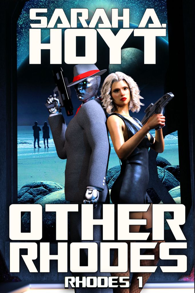
Cover #3:
Much better guns
The robot’s face is a little dark
Turning her towards the camera is a good move
Her hair looks kind of washed-out
Maybe add some muscle and subtle definition to her arms
LikeLike
No. It’s mostly the lighting. And that’s how I want it.
LikeLike
I think the last one, but with the weapons slightly lighter, would nail it for me.
LikeLike
No. They won’t be visible in thumbnail. Also, they are energy weapons (it’s part of the world build.)
LikeLike
The one in the center. It has the most clarity along with the greatest range between the highs and lows.
LikeLike
Yeah, but this isn’t art. As MCA pointed out, it detracts from the lettering. Also, it’s not the “feel” I wanted.
LikeLike
I like the second choice – green suit. Both characters have a competent look in this one, as well as seeming like kind of likeable. In the first choice, he just turns me off, especially the suit looking like it is made of those pumice sticks, totally mineral. In the third one, she totally turns me off, and I can’t get a good feel for him because face is too dark and highlights too glaring.
Basically, I would read the blurb for the second choice cover, prolly not for the other two. My 2¢. ;-)
LikeLike
#3 is an improvement. The sleeve buttons were a good add. Overall appearance is better. The Zorchers are ominous. (Maybe someone has one Rhodium plated?)
Dark Rhodes
Rhode House
Rhodeodendron
The Rhodes Must Role
Rhode Construction
Rhode Closed
Rhodes Not Taken
So you are writing Tech-Noir? Then, “I’ll be back.”
LikeLike
It just struck me, if you really want to be true to the book she should be armed but he should be holding that traditional symbol of sleuthing an old style round magnifying glass, the one with a handle.
LikeLike
Yeah, but no. Doesn’t signal SF
LikeLike
Easy fix, just tuck an exploding rocket icon somewhere in a corner of the cover art.
That should clear things up just fine.
LikeLike
#2 looks like 40 parsecs of bad Rhodes to me…
LikeLike
I really think Rhodes would have a revolver. Now, before you scoff, look at this:
16 rounds in 4 seconds – https://www.youtube.com/watch?v=0FbUMqoyjDw
LikeLike
Sigh. Dude. Different world. Okay?
LikeLike
Be a lot clearer once they’ve read the book, but key element is Rhodes is the brains, his assistant/partner provides footwork and muscle as required.
And I wants me a world where Jerry Miculek is the average shooter, man is awesome.
LikeLiked by 1 person
>> “And I wants me a world where Jerry Miculek is the average shooter”
Hmm… I doubt this is what you’re thinking of, but the game Invisible Inc. comes to mind. There’s a lot of wasted bullets in the opening cutscene, but in actual gameplay no one misses a shot. Ever.
LikeLike
Middle one except black gun and that his hat looks weird.
Agreed on her gun not looking like a big red gummy bear.
LikeLike
Middle one?
LikeLike
Have there always been three covers? They were showing up so large I thought there were only two. Oops.
LikeLike
Take the smaller “Sarah A. Hoyt” from the second cover and put it on the first, the it’s a proper noir cover, if that’s what you want, and the slightly smaller text doesn’t crowd the artwork.
LikeLike
The wording is all the exact same size.
LikeLike
I took them from one to the other.
LikeLike
I don’t know if it is possible, but I think that I would prefer the third image, except using her skintone from the first image, his face lighting and the removed lower details from the second one, but keep his face focused forward, so that both are prepared to respond to the same threat.
Both guns should not have so much extension to the rear, as this wouks make themnhard to use.
His gun should be shorter, as he would holster it under his coat. Hers should also be narrower, as her fingers do not extend around the grip (there is a grey area outside of her fingers. There should be a trigger guard, and if her finger is on the trigger, it should not be tight there.
His highlighting in the third image should extend to highlight his right hand, gun, and forearm. Both guns should have some highlighting, and be a little lighter.
The hatband color in the second seems better than the bright red, but still should be a little brighter.
In the title text, “Rhodes” should be taller than “Other”, as “Rhodes” is the series name. Your name might be slightly higher on the page, and slightly shorter, keeping the same width.
The background silhouettes should have some soft shadows forward of them, matching the shadows on the rocks.
My bad. I can pick at things that I could not create, but you asked.
Thanks. John
LikeLike
Number #3 nails it. Love the tie.
What’s the betting line on Sarah never ever asking for cover advice from the nuts here ever again?
_I_ found the exercise very interesting, but I do see your point.
LikeLike
What it taught me is that giving my readers a choice between two alternatives, they make up shit to choose instead.
As if that’s a surprise.
LikeLike
The last (3rd) cover was the one that caught my eye.
LikeLike
That is the cover I intend to use. I made it after the other two.
LikeLike
2nd one.
LikeLike
Okay, #3 is well-nigh perfect. ROLL THE PRESSES! (Oh, sorry, excited for a new series, and got caught up in the ’30s. CLICK THE BUTTON!)
LikeLike
#3. Shadows, shading and colors are the best. imo. #1 was good too but lacked detail. forget #2.
LikeLike
c4c
LikeLike